


Institute president Stephen Hodder, the first winner of the prize in 1996, described all six shortlisted schemes as ‘surprising new additions to urban locations’ united by ‘their exceptionally-executed crafted detail’.
Of the six projects, only two are by practices not previously shortlisted – Reiach and Hall and MUMA – coincidentally for the only two projects outside London.
MUMA’s extension to Manchester’s Whitworth Gallery and Reiach and Hall’s ‘modest’ Lanarkshire Maggie’s Centre are joined by Rogers Stirk Harbour + Partners’ high-end Neo Bankside housing, the University of Greenwich’s architecture faculty by Heneghan Peng, homes for housing association Peabody by Niall McLaughlin, and a school by Allford Hall Monaghan Morris.
Advertisement
Surprisingly Architecture 00’s Foundry scheme was ignored, despite it winning the institute’s London Building of the Year Award and topping an AJ readers’ poll of RIBA Award-winning buildings.
This year’s jury, chaired by RIBA president-elect Jane Duncan, includes Feilden Clegg Bradley Studios co-founder Peter Clegg, Steve Tompkins of Haworth Tompkins which won last year’s prize for its Everyman Theatre in Liverpool, and arts philanthropist Theresa Sackler.
For the third consecutive year, there will be no prize money.
The winner will be revealed at a ceremony at the RIBA’s Portland Place HQ on 15 October.
Burntwood School by Allford Hall Monaghan Morris

Client Wandsworth Borough Council
Contractor Lend Lease
Structural engineer Buro Happold
Services engineer Mott Macdonald Fulcum
Landscape Architects: Kinnear Landscape Architects
Contract value £40.9 million
Date of completion 2014
Gross internal area 21,405m²
This is a truly collaborative project in which mature architects with deep understanding and experience of what makes for a good school, working with landscapers who believe that a light touch can transform an existing landscape, and a graphic artist whose work has long made way-finding an art form in AHHM projects, to produce one last hurrah for the Building Schools for the Future programme. And, lest we forget, BSF may have been based on a wasteful methodology but it did have at its heart a desire to improve the fabric and learning environments of all our schools.
Burntwood also reminds us of the previous time when such aspirations were the norm: the 1950s and early ‘60s when the LCC and GLC programmes led by Leslie Martin were giving London light-filled, beautifully organised schools. Here at Burntwood a fine Leslie Martin-designed building has informed the new architecture and the relationship between the new concrete buildings and the older buildings adds a sense of architectural history and depth to the whole site. It gives the lie to the notion that the super-block with the vast wasteful atrium is the answer to the question, how do we best design a school?
Burntwood has the collegiate air of an Ivy League campus – perhaps it’s all the pale, finely-detailed concrete, perhaps it’s the elegant covered walkway that links the principal buildings, drawing together the disparate styles and ages of the architecture. The basic module, made up of alternated pre-cast panels, is used creatively to produce blocks of different character for different purpose. One, cut through to form a gateway, affords a great sense of arrival and an immediate impression of quality, openness, confidence, solidity. The architectural expression throughout is bold, characterful and adds to a sense of this being more like a university than a school, and would appear to encourage behaviour to suit. AHMM have produced grown-up buildings for Burntwood School, which make kids raise their game, instead of pandering to them.
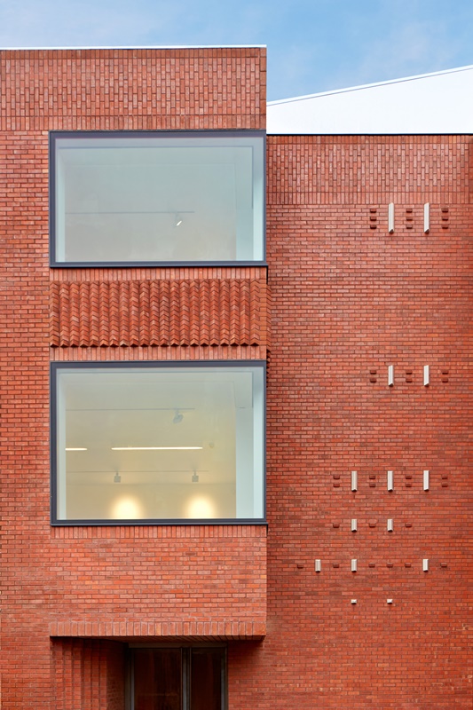
These are buildings with great force. A modular pre-cast concrete cladding, using eight different moulds, with canted edges and different sized glazing panels is playfully arranged on a rigid grid creating surprising interior spaces. The rooms are gracious and full of light, and there are many double, even triple-height spaces. Internal corridors all end in well-framed views. This is education architecture as it should be.
Darbishire Place by Niall McLaughlin Architects

Client Peabody
Contractor Sandwood Design and Build
Structural engineer Ellis & Moore
Services engineer Nifes
Quantity surveyor Pellings
Contract value £2.3 million
Date of completion 2014
Gross internal area 1,084m²
Peabody has a fine tradition of providing social housing for Londoners and appointing the best architects to help them do so. Under the leadership of Dickon Robinson in the nineties and noughties, they upgraded and added to their ageing stock with excellent new developments (earning them an RIBA Client of the Year Award) but none so exquisitely done as Niall McLaughlin’s work in east London.
This is a brilliant piece of urban design. The dignified new building, with its refined proportions and details, replaces a well detailed and proportioned Peabody mansion block taken out in World War II by a V2 bomb, along with another block whose footprint now provides a garden at the heart of the newly completed courtyard still graced by the remaining three Edwardian blocks.
A casual comparison of the old and new elevations reveals the subtlety of the new architecture. The use of materials and form means that the new building complements its neighbours without mimicking them. It represents a re-invention of the deep reveal: the use of slightly projecting pre-cast reveals to the windows and balconies gives an unusual depth to the modelling of the facades, a subtle beauty. The way a sliver of the building on the south side slides out of the square and forms a very narrow and elegant elevation that leads one into the scheme, provides a further level of interest and architectural distinctiveness. It also made the scheme stack up – the extra few flats made viable the completion of the square that Peabody had not contemplated in 70 years.
Internally the plan naturally invites you to use the stair – and what a stair: residents must feel a million dollars, like stars on an ocean liner, all graceful curves, an elegant swooping hand-rail and all that top-light. All but the smallest flats are dual aspect. The plan also allows each flat a vestibule off the landing, an enclosed space they can fill with plants or the over-flow of their flats, it doesn’t matter because it is theirs. The balconies likewise: each has a generous deep balcony from which to watch the children play in the safe square.
The building oozes care. For example, the architects first chose a grey brick to match the soot- stained Victorian London brick. Then Peabody decided to clean the blocks revealing their glowing cream and, in the nick of time, the architects were able to change their order for a pale honey colour that gives the work so much more character. Darbishire Place was delivered through design and build but shows that the quality of the architecture and the continued involvement of the architect is more important to success than the means of its delivery. This is a proper use of an architect’s skills and makes the ordinary exceptional.
Maggie’s Lanarkshire by Reiach and Hall Architects

Client Maggie’s Cancer Caring Centre
Contractor John Dennis
Structural engineer SKM
Environmental engineer KJ Tait
Quantity surveyor CBA
Lighting design Speirs and Major Associates
Landscape architect Rankinfraser Landscape Architects
Contract value £1.8 million
Date of completion 2014
Gross internal area 314m²
This new Maggie’s Centre is on the old Airdrie House estate, which was enclosed by a belt of lime trees, some of which still survive. So far so good. The old house was demolished in the ‘60s to be replaced by Monklands District Hospital in the ‘70s. It’s not a looker. Nor, it be honest, is the housing that abuts it. Airdie cannot afford architectural refinement, or so the thinking went until Reiach and Hall came along. Children of the ‘60s themselves, these are architects who know whereof they speak. They have designed hospitals aplenty and won awards for them, in particular New Stobhill in Glasgow (mid-listed for the RIBA Stirling Prize in 2010) and even more relevantly the Beatson Institute for Cancer Research, also in Glasgow, in 2009. If anyone can, they can begin to build the bridge between the impersonality of cancer-care in big hospitals and the niche architecture, the womb-like approach of most Maggie’s Centres that coddle the cancer-sufferer without maybe giving them the tools to go back into the world and carry on fighting. This open and uplifting place does that, because it is more like a house we might aspire to own.
So the architects were ideal candidates to solve the problem: how to make something that is of the world and yet gives shelter from it, that turns its back but does not close its eyes. The answer is in a new surrounding perforate wall of hand-made Danish brick that recaptures some sense of paradise – which means literally walled enclosure – offering a degree of separation from the nearby hospital grounds. Stand on the rear terrace and you can see the houses opposite, walk down the steps into the courtyard and they and the rest of the worlds are hidden.
From the outside the wall conceals a modest, low building that gathers a sequence of domestic-scaled spaces. Thus it affords a kind of passive security without blanking out the well-meaning passer-by. Visitors enter a quiet arrival court, defined by the low brick walls and two lime trees. At once, a sense of dignity and calm is encountered. A linear rill, a spring, animates the space with the sound of running water. The house is as much a modest church with a nave for the more public functions (meeting, greeting and the hearth – the Maggie’s table around which tea and mutual support are shared). Two unroofed courts catch sunlight, creating sheltered “sitooteries” (a Scots gazebo) and reflecting back the warm light via perforated copper panels. Then there are discreet ‘chapels’ off the side-aisles: four walls and a door for more private moments, differently scaled from loos where one can contemplate to a big dividable room capable of accommodating big groups – men, stubborn working-class men who find it hard to talk about or even admit to their problem are a major target here and it seems to be working.
This is a truly memorable addition to a noble tradition of specialist health buildings.
NEO Bankside by Rogers Stirk Harbour + Partners

Client GC Bankside (joint venture between Native Land and Grosvenor)
Contractor Carillion
Structural engineer Waterman Group
Environmental engineer Hoare Lea
Quantity surveyor WT Partnership
Landscape architect Gillespies
Contract value £132 million
Date of completion 2013
Gross internal area 42,000m²
Neo Bankside is seductive architecture. On a pocket of land between some single-storey alms houses and the multiplying monoliths that are Tate Modern, the developers have squeezed in a group of exquisite towers and some of the best new landscaping in London. The site has history: there was to have been a single tower that was struggling to fulfil the dual role of social and private housing. The new architects designed for the social housing to be on-site but at the request of Southwark it has been re-distributed around the borough and has all been delivered. The deal meant Tate got part of its site for free from the developer: a different kind of social pay-back. The small footprint private towers sit in a public garden – till 8pm at least – with people invited in to use the shops and cafes or just sit and admire the luscious planting. Overall the scheme contributes to a debate about urban design and building form and is a well-mannered example of a structurally expressive architecture.
Project-directed by partner Graham Stirk, an architect with a watch-maker’s precision, this is a tour de force: in its achievement of density, in its use of economical pre-fabricated elements, in its intricate weaving of public and private space. The form and positioning of the blocks with their counter-intuitively chamfered corners mean there are very few pinch points and little overlooking, allowing 360 degree views out. Coupled with the exo-skeletal structure and the nearly detached lift-towers, the floor plates have been freed up making the scheme more market-responsive.
The articulation of the buildings, the expressed diagrid structure (argued for by the engineers, it was to have been hidden), the quality of the glazing systems and the external lifts make the scale feel almost cute. This is also due to the single-glazed large triangular winter gardens that dematerialise the ends of the blocks and the triple-height structural module which reduces their perceived height. The buildings retain a human scale at ground level due to their rich detailing and landscaped entrance gardens. This is high-quality housing you would be unlikely to see elsewhere in the world in the inner city – and it is ungated. Overall the scheme has a scale and a richness that is appropriate to the practice and to this important part of London.
University of Greenwich by Heneghan Peng Architects

Client University of Greenwich
Contractor Osborne
Structural engineer Alan Baxter Associates
Environmental engineer Hoare Lea
Acoustic engineer Sandy Brown Acoustics
Project management Fanshawe
Lighting design Bartenbach Lichtlabor
Contract value £38.9 million
Date of completion 2014
Gross internal area 15,200m²
Located in the UNESCO World Heritage Site at Maritime Greenwich and opposite Hawksmoor’s St Alfege, this building, with all its frisky gravitas, provides the main university library and the departments of Architecture, Landscape and Arts. It is a startling building to put in Greenwich. Most new building in such a context is too concerned with looking over its shoulder to achieve real architecture. So to do other than just a piece of urban knitting is a considerable achievement. It has also to be said that with the honourable exception of Westminster, few other schools of architecture are served by good architecture. This is a building that will inspire future generations of architects, and with their delightful experimental allotments on the roofs, of landscape architects: the building steps down to the rear, providing externally a series of generous terraces for the landscapers to experiment with a wide variety of layouts and species.
Conceptually strong in urban design terms, it relates well to the street in terms of its materiality and massing. The building broken down both in plan and section into a series of smaller elements separated by courtyards and staircases, and articulated at the street level as a series of retail units. The plan follows a clear diagram with its parallel fingers of accommodation separated by courtyards which extend to break up the long street-facing elevation. Externally the forms are well articulated giving depth and interest, with fenestration carefully considered to take advantage of key views, vistas and reflections, particularly on the long side elevation facing the railway. The building is full of light and generous spaces and benefits from clear vertical circulation – the acoustics are remarkable.
In the architectural school, a generous triple-height central crit and display space is visible from many levels and connects to the circulation stair, providing a focal point for all the internal spaces. The graphic qualities of the diagonal form of the dark-clad linking staircase provide an orientation point and signpost within each of the two buildings. Generous ceiling heights make the building light and airy to use and allow the exposed services to sit comfortably on the polished concrete soffits. All the interiors speak of quality. The architects have created cool educational spaces which can evolve over time. The lecture theatres, mostly burrowed underground, make up for lack of light with a sumptuousness of materials and detailing. A nicely done gallery addresses the street inviting the public in, as do the shop and café. This is a very public university building.
The Whitworth by MUMA

Client The University Of Manchester Estates / The Whitworth
Contractor ISG/Manchester & Cheshire Construction
Structural engineer Ramboll UK
Services engineer Buro Happold
Project manager Deloitte/Cragg Management Services
Cost consultant Appleyard & Trew
Acoustic consultant Hann Tucker Associates
Soft landscaping Sarah Price Landscaping
Access consultant Lisa Foster Associates
Fire engineer Buro Happold FEDRA
Contract value confidential
Date of completion 2015
Gross internal area 1,856m²
A project for all seasons, where art, nature and architecture combine - this could be the eulogy for a building which is neither high-key nor overtly fashionable, rather it is reminiscent of 1950s Aalto. This extension to the extended 19th century Whitworth Gallery on the edge of Whitworth Park in Manchester builds on John Bickerdike’s 1960s work in a way that on entering seems subtle in the extreme but then gradually builds outwards in a sympathetic but entirely original way. The worst of the 1960s additions to the 19th century gallery, such as suspended ceilings, have been stripped out and earlier spatial relationships reinstated; the gallery now embraces the park. The café is both a pavilion in the park and a place from which to look back into the galleries. The structural stainless steel mullions of the new rear elevation and café both dissolve and reflect.
The scheme revises the basis of the environmental standards for exhibiting art with old and new galleries flexible enough to be black-box or allow daylight in. The environmental strategy is equally inventive taking a passive-first approach that has been delivered unobtrusively, with no exposed services whatsoever – a curator’s delight.
The creation of an elegant new basement collections space has also unlocked a grand hall which, with its near-criminal suspended ceiling and decoration, was the Whitworth’s big secret. It is now a lecture hall, education space and so much more, its timber trusses exposed, together with its Victorian grandeur, symptomatic of the way in which the architects have throughout unlocked a great old institution.
The importance of the role of Gallery Director Maria Balshaw, and of the University of Manchester as a whole, has been recognized in Whitworth being named Museum of the Year in 2015. Their brief allowed the architects the space they needed. They proceeded with great care, first re-landscaping the forecourt to provide a sculpture venue with almost imperceptible access ramping, through to the foyer leading to a Bickerdike-fitted cross-circulation gallery, and on to the main gallery where the removal of yet another suspended ceiling exposed the original barrel vault into which air conditioning has been invisibly inserted. Then they created the archive store in the undercroft and extended out with a glazed cloister underneath providing study areas shaded with almost impossibly slender fins and above a new glazed corridor-cum-linear gallery linking the restored galleries and the new one which is highlighted above the north elevation and backlit at night to announce the gallery’s presence.
This is not just conversion or adaptation of the existing, the new architecture emerges quite seamlessly as an integral yet individualistic part of the whole assembly.
Leave a comment
or a new account to join the discussion.